
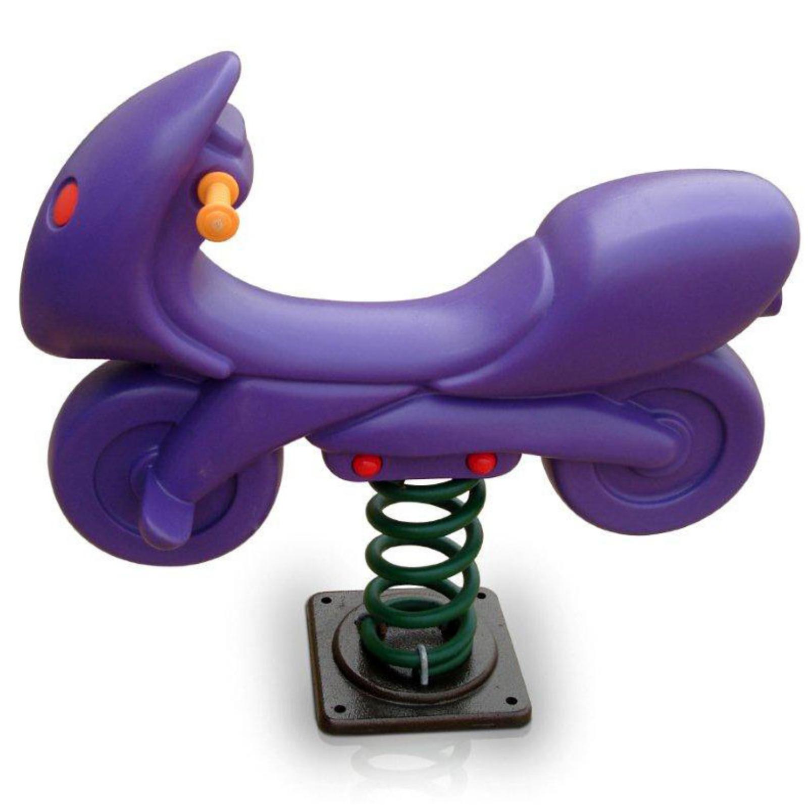
Color selection for playground equipment goes beyond aesthetics - it impacts child engagement, safety visibility, heat absorption, and integration with surroundings. Understanding color psychology, practical considerations, and design principles helps create visually appealing and functional play spaces.
Why Colors Matter
Impact Areas
| Area | Color Influence |
|---|---|
| Child engagement | Attraction, excitement |
| Safety | Visibility, zone identification |
| Temperature | Heat absorption |
| Aesthetics | Visual appeal, integration |
| Branding | School/community identity |
| Longevity | Fading visibility |
Color Psychology in Play
| Color | Psychological Effect |
|---|---|
| Red | Energy, excitement, action |
| Blue | Calm, trust, imagination |
| Yellow | Happiness, optimism, attention |
| Green | Nature, balance, growth |
| Orange | Enthusiasm, creativity, warmth |
| Purple | Imagination, creativity, mystery |
Standard Color Options
Primary Colors
Red: - High energy appeal - High visibility - Popular choice - Heat absorption consideration
Blue: - Universal appeal - Calming effect - Popular with parents - Lower heat absorption
Yellow: - Cheerful, bright - High visibility - Attention-grabbing - Fades faster
Secondary Colors
Green: - Natural integration - Calming - Popular for nature themes - Good durability
Orange: - Energetic - Visible - Warm feeling - Moderate durability
Purple: - Creative appeal - Less common - Distinctive - Good durability
Neutral Options
Earth Tones: - Natural aesthetics - Landscape integration - Lower visual impact - Heritage appropriate
Need Playground & Play Equipment?
CBM IMPEX is a Bangalore-based B2B supplier of playground and play equipment across Karnataka — genuine products, professional installation, and after-sales support.
Practical Considerations
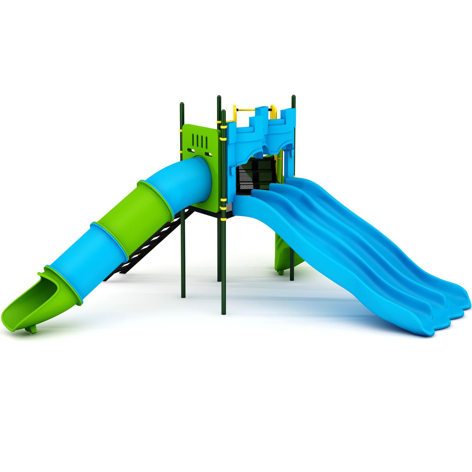
Heat Absorption
| Color | Heat Absorption |
|---|---|
| Black | Highest |
| Dark blue | High |
| Dark green | High |
| Red | Medium-High |
| Orange | Medium |
| Yellow | Low |
| Light blue | Low |
| White | Lowest |
Recommendation: Lighter colors for hot climates
UV Resistance and Fading
| Color | Fade Resistance |
|---|---|
| Blue | Excellent |
| Green | Very Good |
| Brown/Earth | Very Good |
| Red | Good |
| Orange | Good |
| Yellow | Moderate |
| Purple | Moderate |
Quality Factor: UV-stabilized LLDPE resists fading better
Visibility for Safety
| Purpose | Color Choice |
|---|---|
| Age zone marking | Distinct colors per zone |
| Equipment visibility | Contrasting with surroundings |
| Boundary marking | High contrast |
| Night visibility | Lighter colors |
Design Approaches
Theme-Based Selection
Nature Theme: - Greens (various shades) - Browns, earth tones - Natural accents - Coordinates with Nature Collection
Ocean Theme: - Blues (multiple shades) - Turquoise - White accents - Yellow (sun)
Rainbow/Vibrant: - Multiple primary colors - Each equipment different - Varied and exciting - Popular with children
Classic/Traditional: - Primary colors - Red, blue, yellow - Timeless appeal - Recognized playground look
School/Institutional
School Colors: - Match institutional identity - Brand consistency - Custom color options - Pride building
Neutral/Professional: - Subdued colors - Integration with buildings - Less maintenance visible - Professional appearance
Residential/Community
Landscape Integration: - Coordinate with surroundings - Complement gardens - Natural aesthetics - Property enhancement
Vibrant Appeal: - Bright, attractive - Family appeal - Marketing value - Community focal point
Zone-Based Color Strategy
Color Zoning
Age Zone Identification:
Toddler Zone: Soft pastels, light colors
Children Zone: Bright primaries
Adventure Zone: Bold, darker colors
Activity Zone Identification: - Active play: Warm colors (red, orange) - Calm play: Cool colors (blue, green) - Balance/Focus: Neutral/earth tones
Wayfinding with Color
| Element | Color Use |
|---|---|
| Entry/Exit | Distinctive color |
| Pathways | Consistent color |
| Zones | Different colors |
| Boundaries | Contrasting |
Equipment-Specific Considerations
Spring Riders
Popular Choices: - Animal colors (natural or bright) - Theme-consistent colors - Varied within playground
OK Play Options: - Duck Rider - Yellow, colorful - Elephant Rider - Gray, natural - Various themed colors available
Multi-Play Equipment
Funstation Equipment: - Multiple colors typically - Coordinated palette - Visual variety - Zone identification possible
Swings and See-Saws
Frame Colors: - Typically coordinated - Powder coating options - Weather consideration
Seat Colors: - LLDPE color options - Rubber color options - Safety visibility
Climate Considerations
Hot Climate Recommendations
| Element | Recommendation |
|---|---|
| Equipment | Lighter colors |
| Metal | Light coating |
| Seats | Light colors mandatory |
| Slides | Light colors (touch safety) |
Coastal/Marine Environments
Recommendations: - UV-resistant colors - Salt-resistant finishes - Visible in bright light - Not too dark (heat)
Varied Climate
Versatile Choices: - Medium tones - UV-stabilized - Heat-balanced - Good visibility
Color Coordination Strategies
Complementary Colors
Examples: - Blue + Orange - Yellow + Purple - Red + Green
Effect: High contrast, vibrant
Analogous Colors
Examples: - Blue + Green + Teal - Yellow + Orange + Red - Purple + Blue + Pink
Effect: Harmonious, flowing
Triadic Colors
Examples: - Red + Yellow + Blue - Orange + Green + Purple
Effect: Balanced, vibrant
Monochromatic
Example: - Various shades of blue - Light to dark greens
Effect: Sophisticated, unified
Custom Color Options
When to Consider Custom
| Situation | Custom Benefit |
|---|---|
| School branding | Identity match |
| Theme requirements | Specific colors |
| Landscape matching | Integration |
| Large orders | Volume availability |
Custom Color Process
- Color specification (Pantone/RAL)
- Manufacturer capability check
- Sample approval
- Production time allowance
- Price consideration
Cost Implications
Standard Colors: - No additional cost - Immediate availability - Proven durability
Custom Colors: - May have premium - Lead time required - Minimum quantity possible - Testing recommended
Maintenance Considerations
Color Preservation
Best Practices: - Quality UV-stabilized materials - Regular cleaning (prevents buildup) - Shade where possible - Prompt touch-up (metal)
Touch-Up Requirements
| Material | Touch-Up Need |
|---|---|
| LLDPE | Rarely needed |
| Powder coating | As damage occurs |
| Painted surfaces | Periodic |
Fading Expectations
Timeline (quality materials): - Year 1-3: Minimal change - Year 3-5: Slight mellowing - Year 5-10: Noticeable but acceptable - Year 10+: May need assessment
Selection Checklist
Before Selecting Colors
- [ ] Consider climate/weather
- [ ] Check heat absorption needs
- [ ] Identify theme (if any)
- [ ] Consider surroundings
- [ ] Check institutional requirements
- [ ] Assess maintenance capability
- [ ] Review available options
- [ ] Consider custom if needed
Final Selection
- [ ] Matches purpose
- [ ] Practical for climate
- [ ] Visible for safety
- [ ] Appealing aesthetically
- [ ] Durable long-term
- [ ] Budget appropriate
Design with Color
CBM IMPEX offers:
- Wide color range
- Color consultation
- Custom color options
- Quality UV-stabilized products
- Theme coordination
Discuss Color Options!
📞 Call: +91 93430 88815
💬 WhatsApp: +91 93430 88815
📧 Email: info@cbmimpex.com
🛒 Browse Products: shop.cbmimpex.com
Get color samples and recommendations!